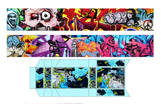
 For my project I wanted to incorporate the urban theme that was present in my composition that I had to create in photoshop. I started off finding a template of a cigarette box and then imported it into illustrator and traced the main lines that I saw. I then found the diameter of the inside of the box and expanded the width of it. I took pictures of different graffiti drawings in the city and then incorporated them all together on one wall. I then folded the entire wall into an accordion style and it fit nicely into the box. I really liked this project because I was able to play with high contrast color and morph a bunch of different art works into one.
Wednesday, May 5, 2010
Final Project
 For my project I wanted to incorporate the urban theme that was present in my composition that I had to create in photoshop. I started off finding a template of a cigarette box and then imported it into illustrator and traced the main lines that I saw. I then found the diameter of the inside of the box and expanded the width of it. I took pictures of different graffiti drawings in the city and then incorporated them all together on one wall. I then folded the entire wall into an accordion style and it fit nicely into the box. I really liked this project because I was able to play with high contrast color and morph a bunch of different art works into one.
Friday, April 30, 2010
Self-Portrait Illustrator


For my second project done in illustrator I decided to first take the same picture of me as the first self portrait except I flipped it around. I then changed it to grayscale mode and live traced it using only 5 shades of gray. I then put another layer on top of it and used C's that were the same shade as the grayscale piece to fill it in appropriately to make it look more like my face. I decided to do the hair in a way that the C's are all facing different directions to give it a more hair like effect. For the skin i just left all the C's the normal way. I struggled slightly with this piece because there were so many of the same colored C's to deal with and they kept getting lost throughout the process. I feel though that this is a pretty successful piece because of the fact that it has the outline of my face and when viewed from a distance looks like an actual black and white version of a face.
Self-Portrait Photoshop
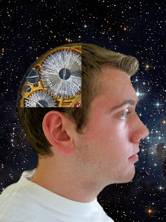 For the first self portrait done in photoshop I wanted to combine the inside of my head with the gears of the inside of a watch. First I cut myself out of a picture that was taken of me and re-adjusted the contrast to make myself look better with the back ground. I then cut out a piece of my head and put the gears of the watch behind it. To go along with the surreal theme I decided to put the background of stars and out space. I feel that this portrait is pretty successful because it shows me in from a surrealistic view with a clock instead of the back of my head. I didn't really struggle at all with this piece so I didn't mind working on it.
Wednesday, April 14, 2010
Beever & Brennecke Presentation
The two artists that I chose to put into my art show is Julian Beever and Jochen Brennecke. Julian Beever is a sidewalk chalk artist that would create pieces that only looked correct from one point of view. Jochen Brennecke is a digital artist that would put everyday pictures and objects and would combine them into one image to create a surreal image. The are very similar because they deal with the theme of abstraction and a distorted view. For Beever's works you could only stand at one point for the image to look completely correct. Also a large amount of people are able to view his pieces at once. Brennecke's works are able to be viewed from any angle except they are post card sized papers. The size of the work only allows one person to view it oat once so that they can gather their own information from the piece and interact with it on a personal level. Both artists deal with a similar theme but work in a completely different medium.
Whitney Biennial Visit
Last week I visited the Whitney Biennial and I was actually surprised at some of the works. I'm glad that I had prior knowledge to some of the works because I looked at some of the exhibits that were up online. One of my favorite artists that I saw at the museum was Verne Dawson. I liked how he used paint to create an abstract piece that looks somewhat realistic. I also liked the symmetry that was seen in many of his pieces. Another artist that I was really attracted to was Roland Flexner. He also worked a lot with abstract work and in black and white. I'm pretty sure that he used white charcoal on black paper which created a very interesting effect. My last artist that I really liked was Pae White. He created a large tapestry that was titled smoke and was stretched across a wall. It was done with cotton and polyester so that it has a very organic effect to it.
Wednesday, April 7, 2010
Logo Trace
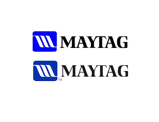 For this project we had to trace a logo so the logo that I decided to trace was the Maytag logo because it had a variety of curves and straight lines ad it also incorporated text too. I couldn't get the exact color blue so I colored in the symbol as close as I could. The top one is the logo that I traced and the bottom one is the original logo.
Wednesday, March 17, 2010
Composition 2
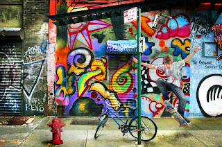 For this image I also decided to use an object, a person, and a background. The graffiti background was a picture of a wall that I took in the city. I then also put the picture of the fire hydrant in the bottom left of the picture and added shadows to it so that it would look more realistic. I then put the picture of the skateboarder in and had to fix his contrast and brightness so that it would look like he fit into the picture more. I then had to copy the paste that overlaps his arm and had to copy it over his arm so that it would look like he was behind the post. His shirt originally had a design on it so I used the clone tool to get rid of it and make it a completely white shirt. I then decided to lighten his shirt so that you could see the background behind it but it still looks as if he would be wearing that shirt with a graffiti design on it. The parts that i kind of struggles was trying to get him in the picture without making him look like he was just pasted in. I had to blur the edges so that they weren't too sharp and would look unrealistic. Another slight problem was the shadow under the skateboard because again the burn tool was changing the pavement a strange unnatural color. Over all I feel like this was a successful piece because everything in the piece is realistic and could be happening in real life. I like the touch of surrealism that I added by making the skateboarders shirt see through to make it look like the graffiti design was matching the background.
Subscribe to:
Comments (Atom)